Patterns fill negative space intentionally, while suggesting flow and financial momentum
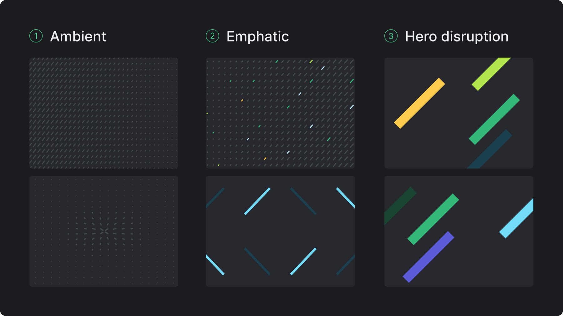
There are 3 brand pattern modes (only 1 mode may be used per composition)
Ambient: For backgrounds, section separation, large layout surfaces (small dashes, low contrast, even distribution, subtle visual texture)
Emphatic: For supporting strong statements (larger dashes, higher contrast, more spacing)
Hero disruption: For supporting strong statements, whenever the layout requires dramatic interruption (large 45° angled stripes, sparse, high impact)
To generate ambient and emphatic patterns, this tool is used
7.B. Color & imagery integration
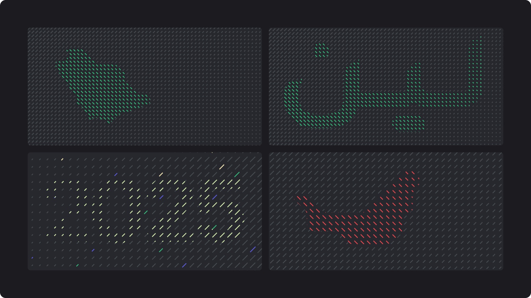
Ambient patterns are primarily monotone in neutral 7, color is only introduced when integrating a graphic or type element that requires focus
Emphatic and hero disruption patterns always integrate the brand’s complementary colors, these modes are inherently expressive and should feel deliberate, not neutral
Imagery inside patterned compositions must be flat, minimally detailed, and recognizable
7.C. Use in layout
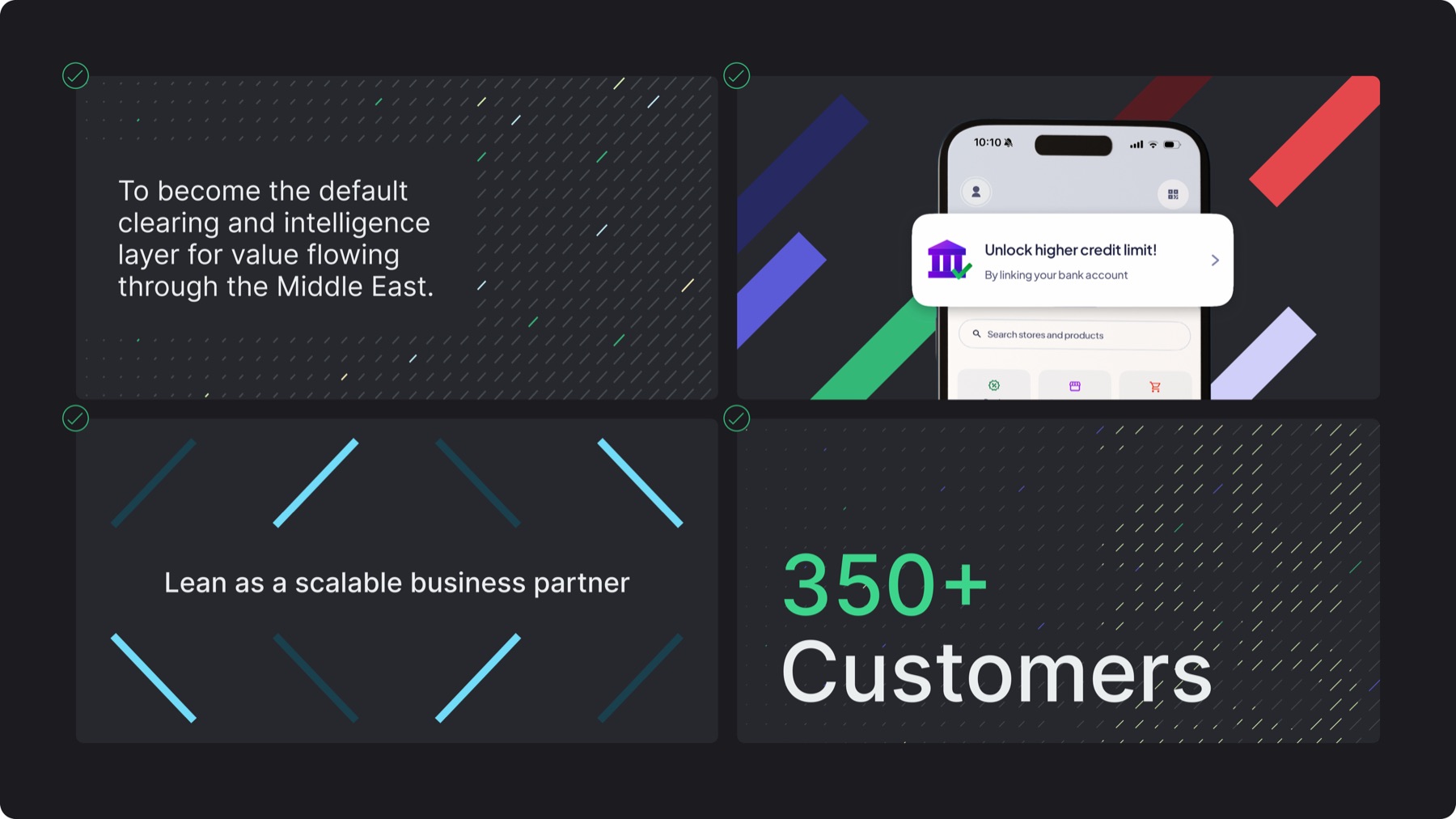
When body text appears over patterns, it must always sit on an overlaying solid background with a safe area to protect the copy from clashing with the patterns
Patterns can be used in bleed or contained within the layout margins
Patterns can be used as visual textures to help structure or frame text in layouts
Patterns may appear behind text only if contrast is sufficient
7.D. Misuses
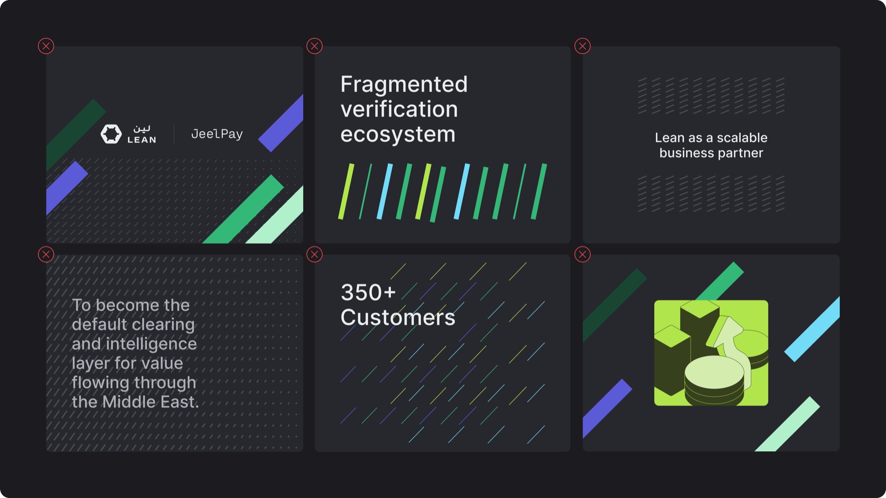
✕Patterns combined across multiple modes in 1 composition
✕Integrating too many colors or more than 1 stroke weight within the same pattern
✕Patterns placed arbitrarily floating within the composition without alignment
✕Patterns making text at the forefront illegible
✕Applying unapproved brand colors such as custom hues or gradients
✕Cluttering layouts by integrating patterns with other rich graphics