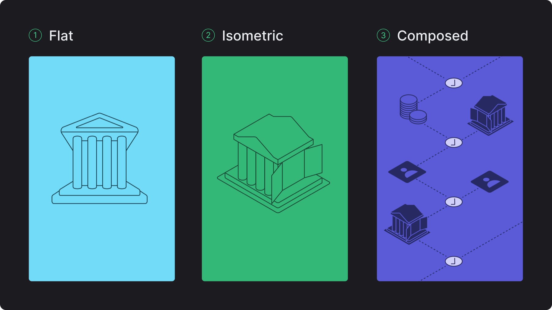
Lean follows 3 main modes for illustrations: flat, isometric, composed
Select the mode based on layout needs and visual balance
In composed scenes, use a single perspective only, all flat or all isometric, never mix the 2
5.B. Creating illustrations
Use geometric forms, avoid organic shapes unless necessary
Minimize details, include only what supports understanding
Build isometric illustrations on an isometric grid, or use tools like the easometric plugin (note: after applying the plugin, select the illustration + cmd e to flatten the vector to avoid stroke size distortions because of the plugin)
Use consistent monoline strokes with round corners and endpoints (typically between 0.7-3pt stroke depending on scale and medium)
Prioritize clarity over realism, communicate fast, not literally
Add regional context when relevant (ex: local architectural cues, palm trees)
5.C. Color treatment
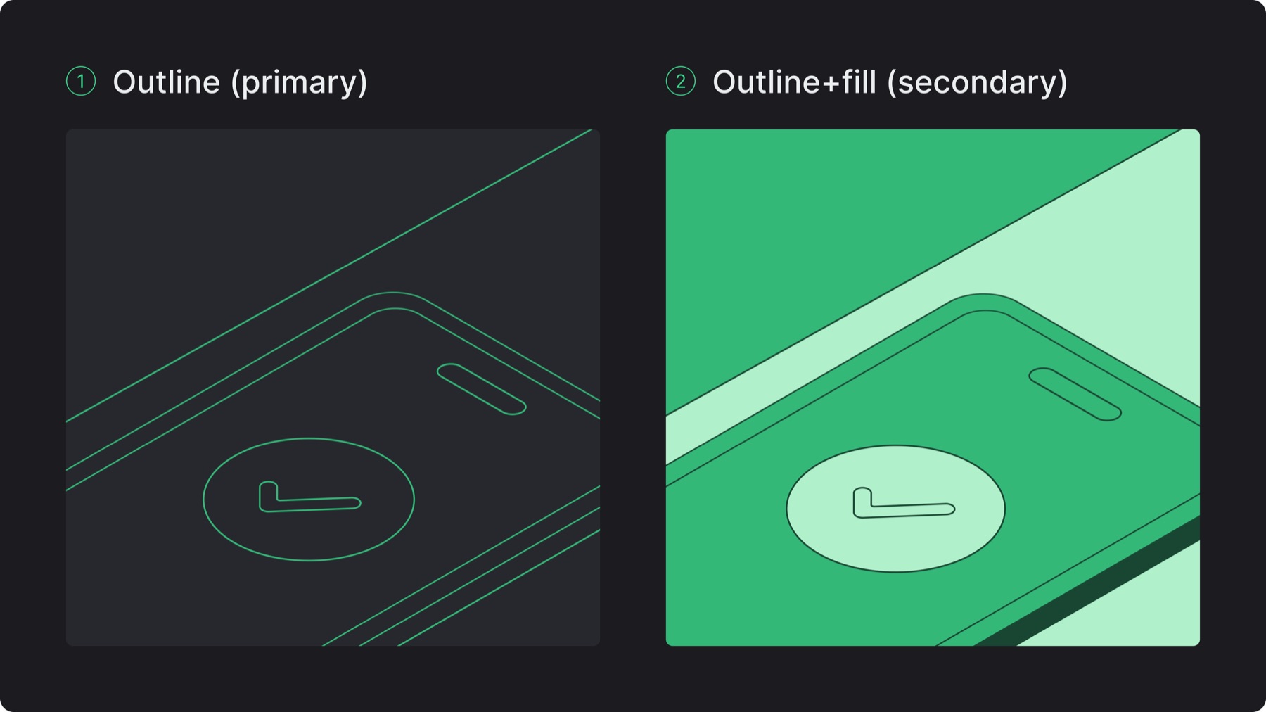
Outline: Primary treatment - use accent green for Lean related illustrations, otherwise use the defined complementary colors for this treatment on Figma variables - keep individual illustrations monotone (no color mixing within a single asset) - when individual illustrations are combined/composed together each one can vary in color
Outline+fill: Secondary treatment - use only within colored containers - apply tonal variations (light/medium/dark) of the same color for depth - use defined complementary colors for this treatment on Figma variables - use color intentionally to highlight what matters
5.D. Use in layout
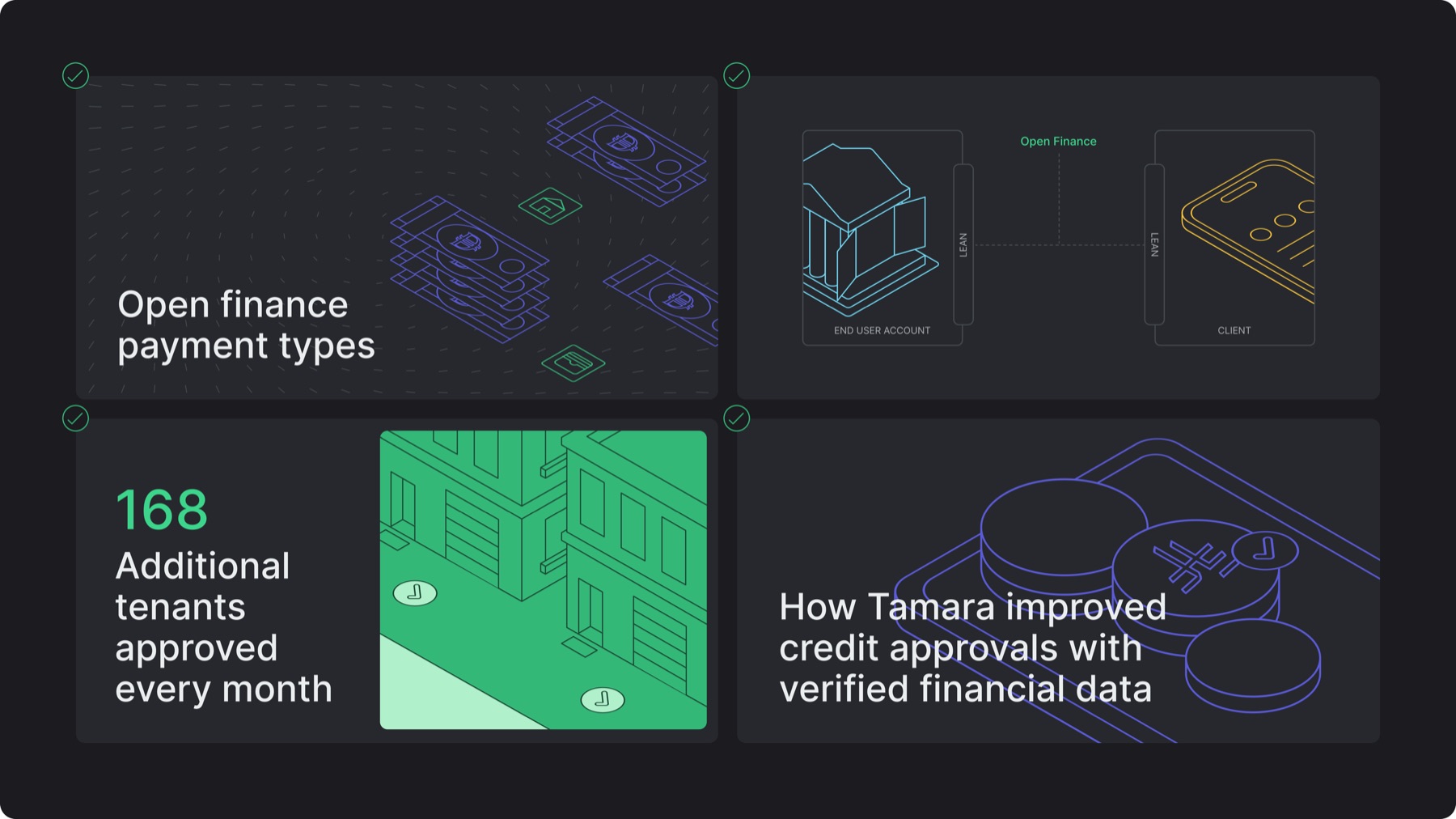
Illustrations may appear full or cropped from the layout edges
Illustrative diagrams are composed with neutral stroke containers in layouts
Place illustrations intentionally, aligned with layout and surrounding elements
Place illustrations under text only if readability is fully maintained
5.E. Misuses
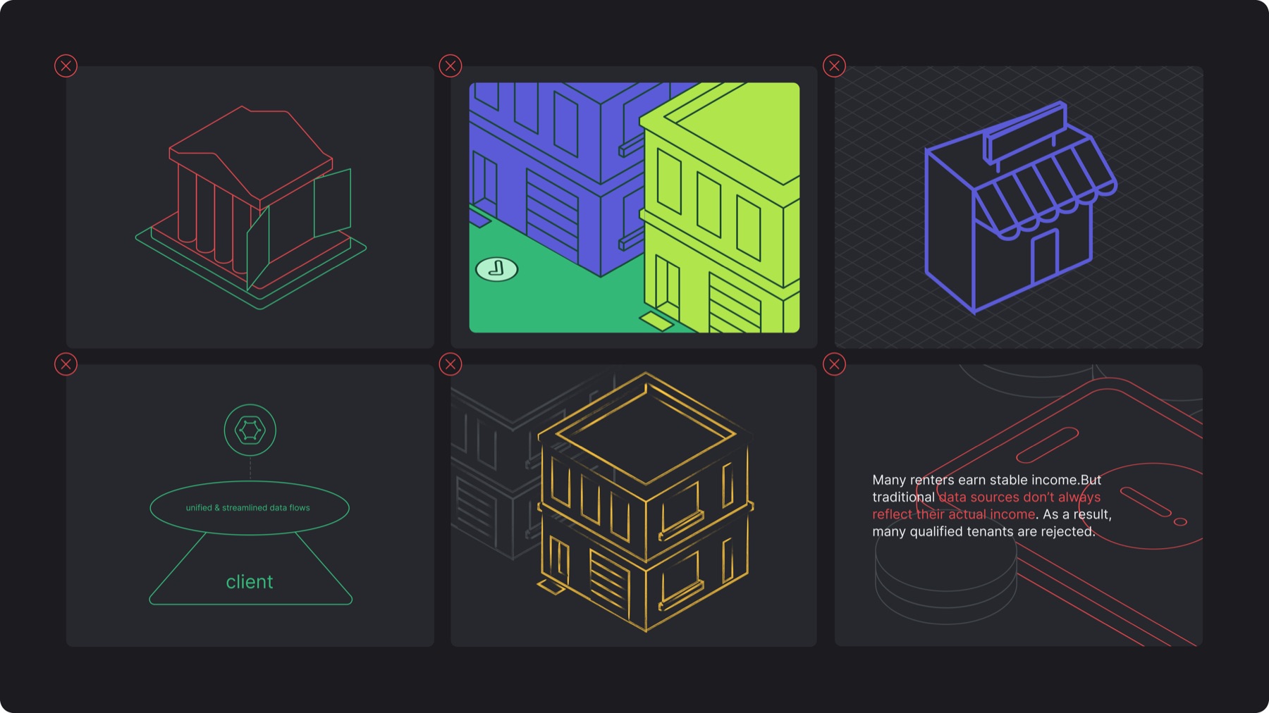
✕Using multiple colors within a single illustration
✕Mixing hues inside colored containers
✕Inaccurate isometric perspective and inconsistent stroke weights (too thick or thin)
✕Using different container shapes and fonts other than Inter Regular (all caps) with illustrations
✕Applying a different stroke style
✕Placing illustrations in ways that compromises readability