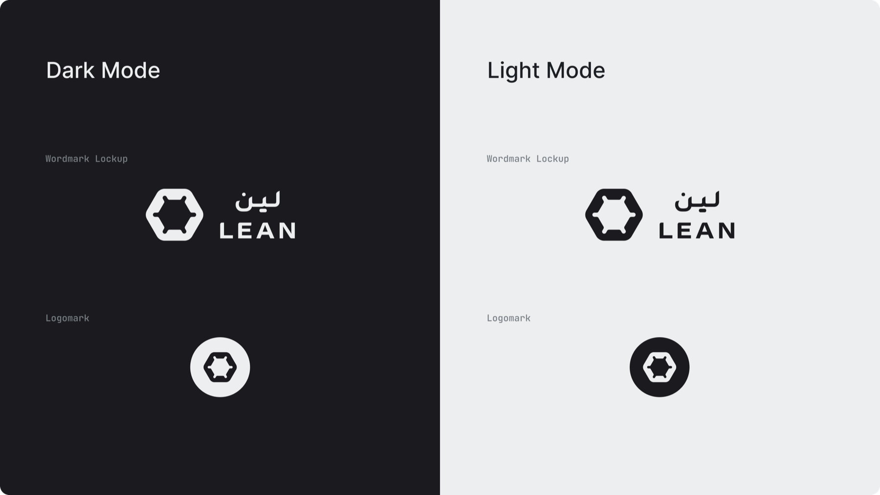
Wordmark Lockup: Primary logo used across most applications. Represents the brand in corporate environments for clear and consistent recognition.
Logomark: The logomark is used in limited, high-context scenarios where the brand is already recognisable. (Illustrations, small-scale placements, environments where the brand is already introduced)
1.B. Sub-brands
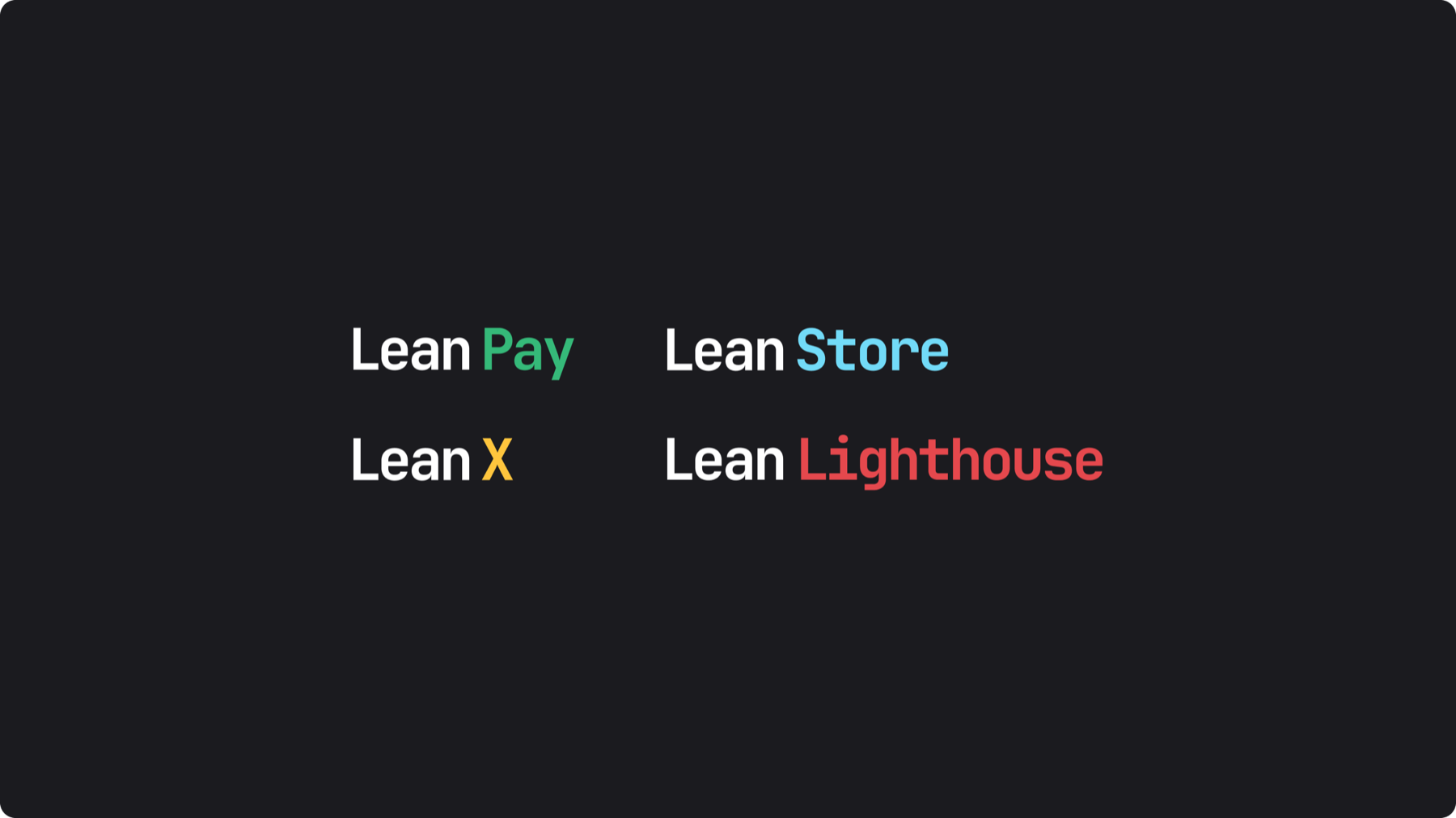
Sub-brands have their own distinct logos, color coded with the brand’s complementary colors.
1.C. Representing partnerships
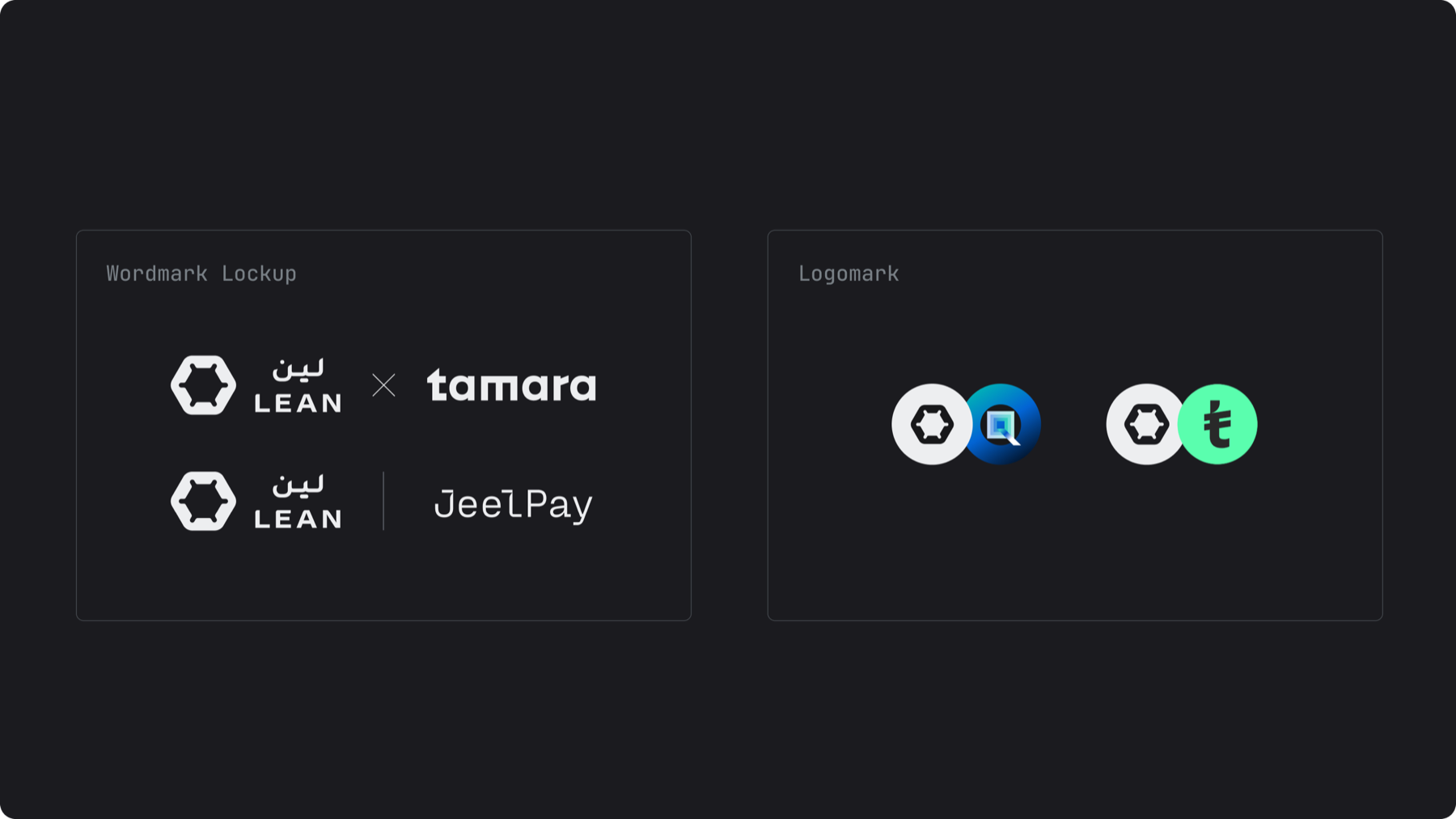
Wordmark Lockup: should be placed next to each other in the same size optically. They should be separated by either an “×” or a line.
Logomarks: should be overlapped, both marks must remain fully recognisable.
1.D. Clear space & minimum size
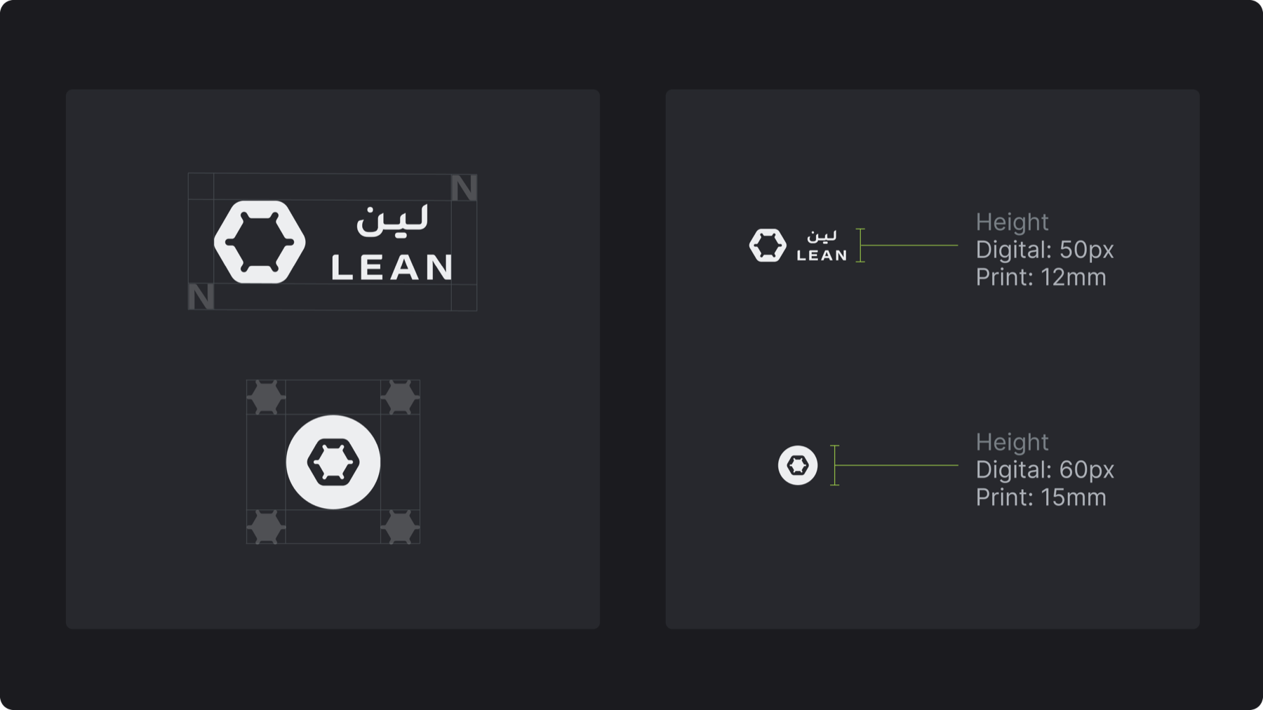
Clear Space: for the wordmark lockup, maintain clear space based on the proportions of the “N” on all sides. For the logomark, the clear space is based on the inner cog. Make sure to not include any text on the clear space
Minimum Size: Wordmark Lockups shouldn’t be smaller than 50px (digital) / 12mm (print), Logomarks shouldn’t be smaller than 60px (digital) / 15mm (print)
1.E. Logo colors
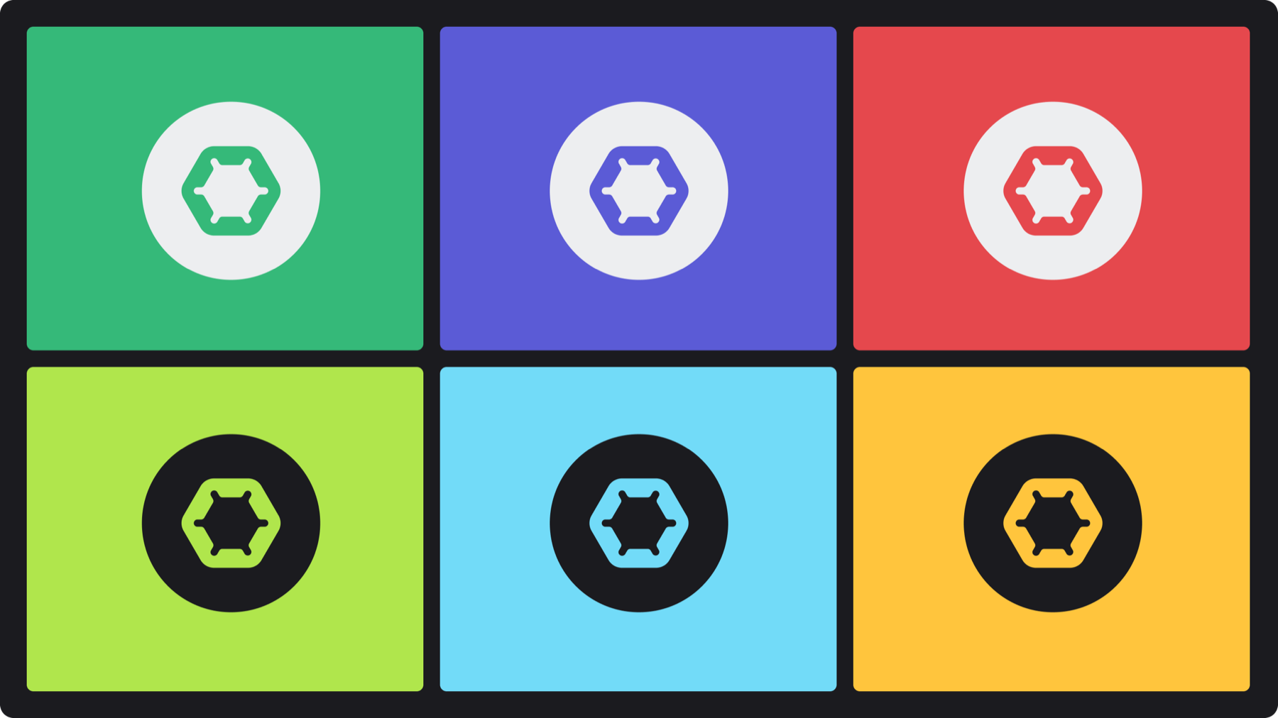
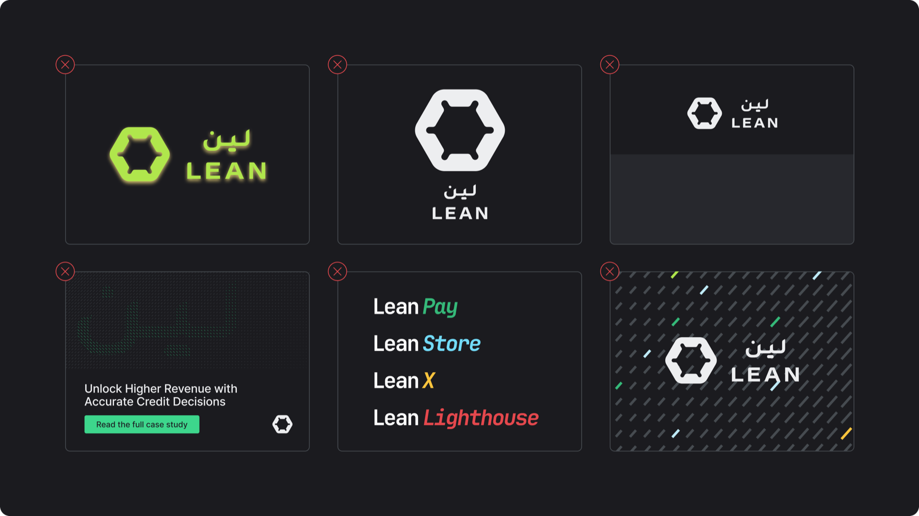
Logos must be black or white only, always using the highest contrast option.
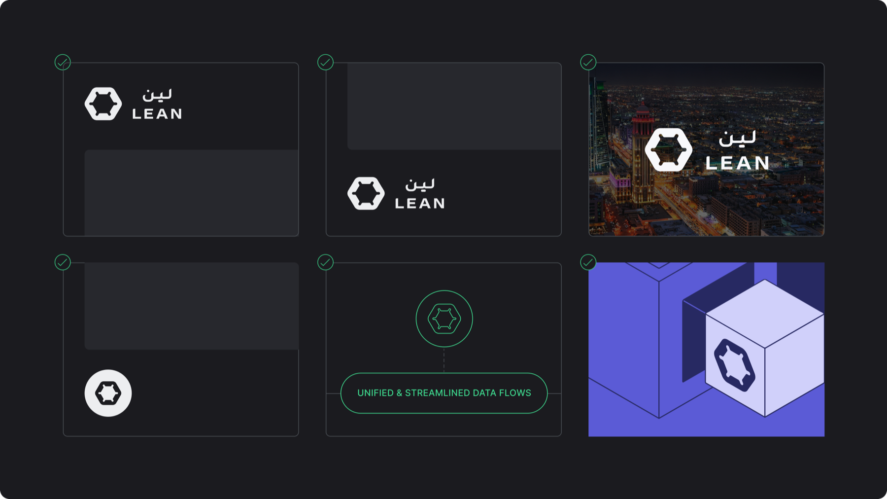
In most applications, the logo can only be filled. However it can be outlined in illustrations/diagrams
The logomark may appear in color within illustrations only.
1.F. Use in layout
Placement: logos should be placed primarily on the top or bottom left of the design. However it can be placed in the middle for imagery and high impact moments.
Logomark: can be used in diagrams and illustrations to represent Lean. The unprotected logomark can be used within illustrations