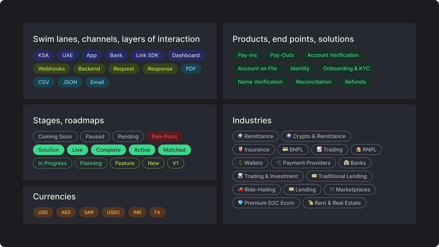
Typography: Inter Medium, title case, center-aligned with sufficient consistent padding
Color: Category-based using primary + complementary palette
Treatments: Fill or stroke treatment with emoji integration only for the industry badges (note: when a badge is placed on a container of the same color, apply a thin stroke using the text color to preserve visibility)
9.B. Use in layout
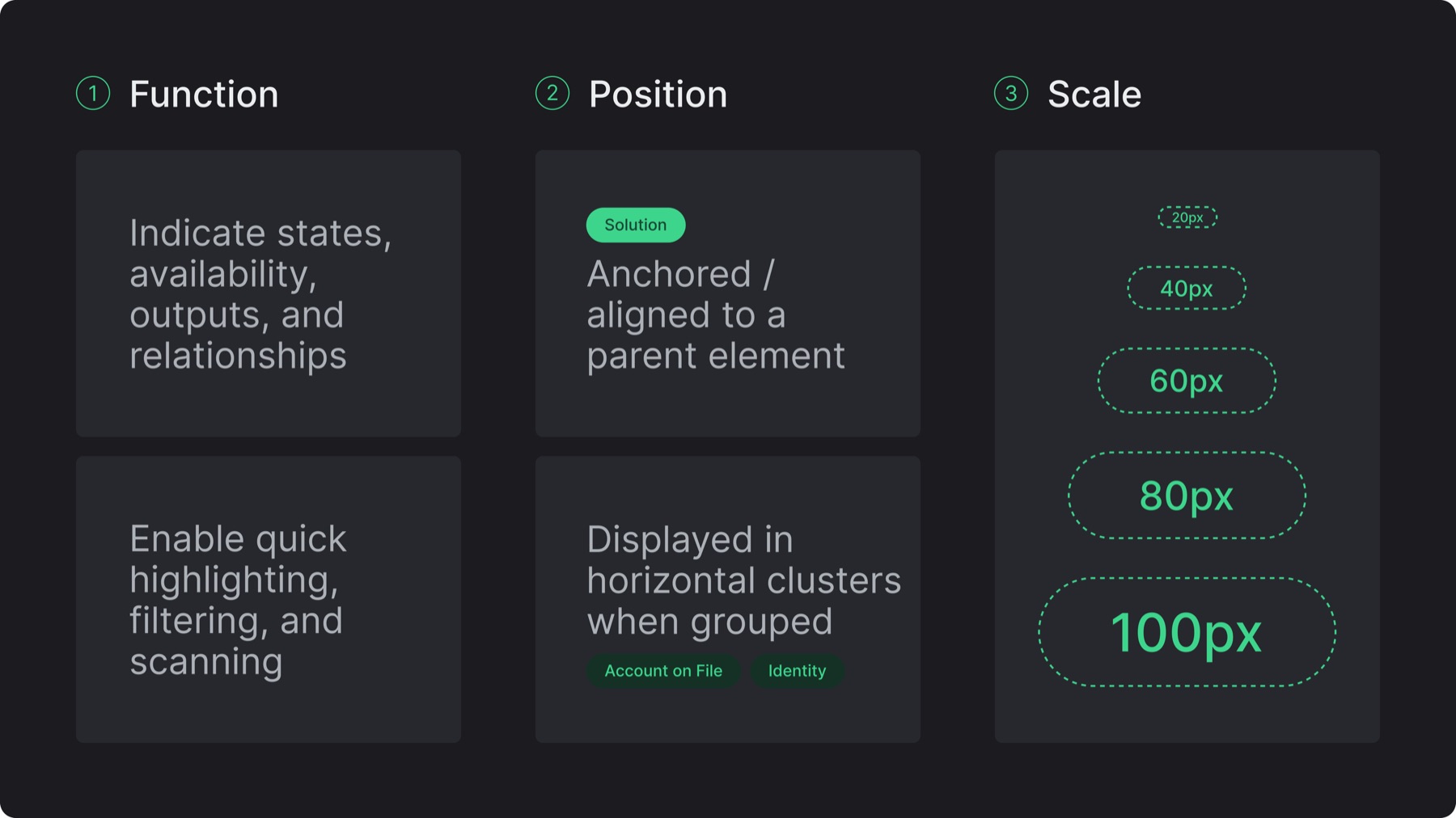
Function: Use badges within layouts to indicate states, show availability, surface system outputs, represent relationships, enable quick highlighting, filtering, and scanning
Position: Badges are anchored or aligned to a parent element (card, section, text block) and are displayed in horizontal clusters with consistent spacing when grouped
Scale: Keep badges visually secondary and consistently sized within a composition, use the standard size scale of 20/40/60/80/100 px, with 40 px as the default
9.C. Misuses
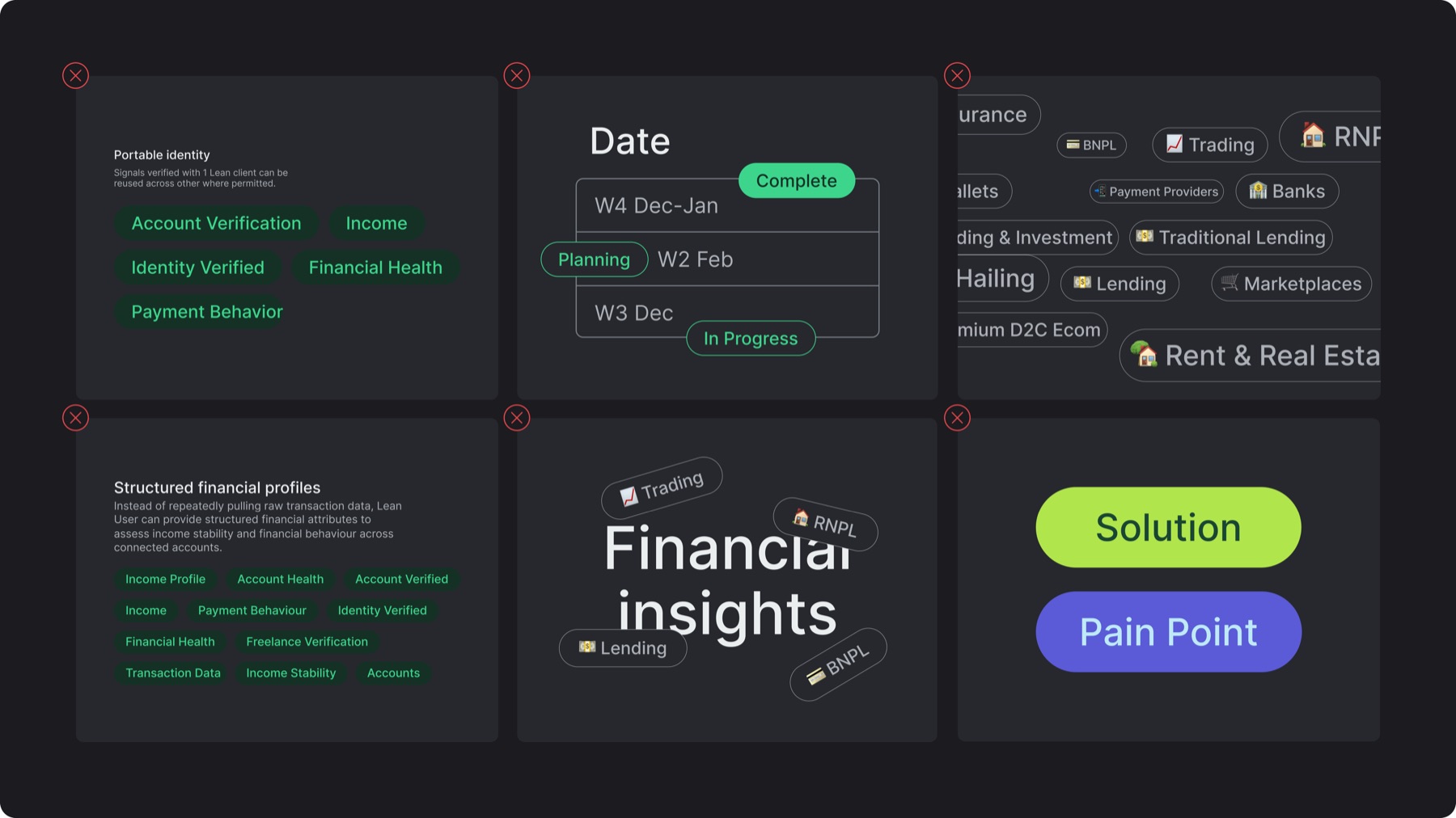
✕Using badges in large scales as primary content or key messaging
✕Floating badges without clear alignment or parent attachment
✕Mixing multiple sizes or inconsistent spacing within the same group
✕Overloading layouts with too many badges (visual noise)
✕Tilting, overlaying type, or using badges decoratively without functional meaning
✕Using incorrect badge colors or changing assigned category colors